
A website, which is adaptable to the screen resolution of the device, is referred to as Responsive website. A responsive site looks same on computer and on the mobile screens without much difference in the features as it resizes according to the screen size.
Sketch to Wordpress Sketch to Magento Sketch to Html
Features of Sketch to Responsive HTML
- Compatible across all Devices and Browsers
The coded text is compatible and can run on any devices or browsers accessible to the user.
- SASS/LESS
We make use of CSS preprocessors for every project in order to deliver the best results. Let us know about your specifications and we shall handle the rest.
- Flexible/Fluid Layout, Fixed Support
The designed layout works smoothly on all the browsers without any glitch whether it is a flexible or fixed layout.
- Time and Cost effective
Responsive designs which are easy to code and include responsive template, cut time and cost for users. The template created is rewarding and striking.
- Several Frameworks Support
Clients can integrate their website with several frameworks such as Twitter Bootstrap, Less, Foundation, Fluid Baseline Grid, and more.
- Semantic Coding
A semantic coding with defined code texts result in a cleaner mark-up without any compromise on utility or speed.
- SEO Friendly and Easy To Manage
A single template feature makes it easy for website handlers and Google crawlers carry on with effective SEO services.
- Support
We promise to address all the concerns that bother you. Notify us and we will be more than happy to help you.
Optional Features
- Retina Display Compatibility Screen Readers Compatibility
Compatible with Retina-supportive devices! It is an advantageous feature for the visually impaired.
- Microformat/Schema and Page Speed Optimization
Search providers can easily access the semantic markup in accord with a web-based approach. Our aim is 90+ score to provide a hassle free user experience.
Why choose team xchop ?
- Non-Disclosure Agreement
- Highest Quality Markup
- Latest Browser Compatibility
- 365 Days Free Support
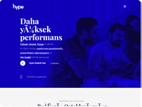
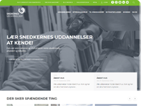
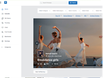
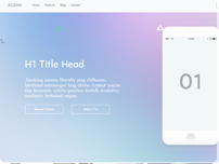
Some things we’ve done.
Frequently Asked Questions
We’ve put together a comprehensive F.A.Q. on the topic of Responsive Web Design. We hope this will help you decide whether this is a valid solution for you. For any other questions not covered here, feel free to send us an email at info@xhtmlchop.com OR contact us.
- 1. What is a "responsive" website?
- A
- A
- 2. Why do I need a responsive website?
- A
With introduction of smartphones, website surfing is not limited to only computers or laptops. Especially for online shopping, clients can maximize their audience reach with a responsive website.
- A
- 3. What are the other benefits of responsive web designs?
- A
Easy to maintain and simple to control, a universal website compatible with both the devices helps you to manage the services effectively.
- A
- 4. What about SEO in responsive websites?
- A
A single SEO template means that every link is directed to the one URL, which enhances the ranking on Google.
- A
- 5. Is my responsive website going to be compatible with any browser?
- A
The developed website is compatible with several browsers, which include Safari, Firefox and Chrome.
- A
- 6. What about older browsers?
- A
A responsive website can function minus any glitch on older versions including the ones based on IE JavaScript solutions.
- A
- 7. Is there a way to check whether my website is responsive or not?
- A
Resize the website layout on the desktop window and if it changes then the website is a responsive website.
- A
- 8. How long will it take to launch a responsive website?
- A
It all depends upon the website a client wants to develop. On an average, it takes up to 3-4 days to develop a fully functional responsive website.
- A
- 9. Can I convert my existing website into a responsive one?
- A
Yes, the professional experts are capable of handling any sort of template modification your website requires to make it a mobile friendly interface.
- A
- 10. What will it cost?
- A
For home page the charge is $149 and $89 for inner pages. The cost for the services is entirely dependent upon what features client opts for. Every minute aspect is discussed beforehand.
- A
- 11. Which devices do we talk about in relation to responsive websites?
- A
Multi-screen compatible website means that your website will be able to function smoothly on computers as well as on your smartphones.
- A
- 12. What are CSS media queries?
- A
A CSS media query is an efficient way to establish a consistent web style with which limitations are set on the scope of style sheet. Find out more at http://mediaqueri.es/
- A
- 13. Can I add images and videos to my responsive website?
- A
Yes, Media queries allow adding flexible image sizes and flexible videos displays.
- A
- 14. What are some screen sizes that a responsive website will adapt to?
- A
The most prominent ones are 320px, 480px, 600px, 768px, 960px, 1024px, 2048px.
- A
- 15. What are examples of some great responsive websites?
- A
Following are some efficient responsive websites. http://74.208.70.104/examples/responsive/1 http://74.208.70.104/examples/responsive/2 http://74.208.70.104/examples/responsive/3
- A
- 16. Which new responsive frameworks are available?
- A
Twitter Bootstrap, and Foundation.
- A