
A HTML website is one that adapts to the screen size of the device from which its viewed. Typically, a HTML site will look similar on the desktop and on mobile/tablet devices. If the page needs to be resized to fit a smaller screen, a HTML page adapts automatically.
Convert PSD to HTML
Convert PSD to HTML is made easy with Xchop. We offer all kinds of PSD to HTML conversion services to the clients worldwide. Our PSD to html conversion services is a quick solution to rebuild semantic and Excellent html Code from photoshop to html, pdf to html and psd to html
At Xchop we have an expert team of html developers working offering PSD to HTML Conversion Service. With an experience working on different clients worldwide developing Html websites as per their business needs. Our bespoke PSD to html conversion services converted psd, pdf and photoshop into interactive, and attractive websites in seamless manner.
Our PSD to HTML Service convert designs into html codes with highest quality markup. We do semantic coding ensuring a clean markup without sacrificing on the quality and speed. The converted websites is compatible on all browsers and devices, SEO-friendly and easy to manage. We also provide 365 days free technical support by the experts resolving the queries and issues fast and accurately.
We specialize in all modern design formats. Choose your source file for specialized coding:
Figma to HTML Adobe XD to HTML Sketch to HTML Design to CodeHTML Perfection in Record Time—Get Started Today!
we specialize in delivering flawless HTML conversions with unmatched speed. Our team of experts is dedicated to transforming your designs into pixel-perfect, responsive HTML code that meets the highest standards.
Convert Your Designs in as Fast as 8 Hours. Buy now
Full-Stack Front-End Standards & Code Quality
-
Cross Browser &Browser Compatibility
We convert your PSD files to HTML website that is compatible on all browsers and devices.
-
Modern SASS Development
We use modern SASS preprocessors to keep your website’s styling code clean, highly organized, and easy to scale. This ensures faster loading speeds, seamless updates, and flawless long-term maintenance for your project.
-
Supports Fixed,Flexible/Fluid Layout
We can create a flexible layout as well as fixed layouts – our methodology ensures a smooth transition no matter what option you choose.
-
Time & Cost Efficient
Website can cut the time & costs. We code your PSD files easily into a HTML websites. The resulting website is attractive & satisfying.
-
Modern Framework OptionsAvailable
We build your designs using top industry frameworks like Bootstrap 5, Tailwind CSS, or Foundation. Whether you need a lightning-fast custom layout or standard, scalable code, we use the perfect framework to match your project goals.
-
SemanticCoding
Our coding is all semantic, so you’ll have a clean markup without sacrificing utility or speed.
-
SEO Friendly Layouts &Easy to Manage
We write clean, semantic HTML code that search engines love. By optimizing your site’s structural layout and performance from the ground up, we help your business rank higher on Google and load incredibly fast for your visitors.
-
Support
Our experts are always active & enthusiastic to assist our clients/customers and answer to their queries fastly & accurately.
PSD to HTML Conversion
Xchop is a professional PSD to HTML conversion service that solves all your design challenges. Whether you need static HTML pages, WordPress themes, e-commerce sites, or custom web applications, xchop has it. xchop has a team of experienced and skilled developers who use the latest he website standards and technology to ensure your website is fast, secure and compatible with all browsers and devices. Xchop also offers a 100% satisfaction guarantee, free support, and affordable prices. If you want to convert your PSD designs into impressive websites, xchop is the way to go.
HTML Web development Service
xchop is a leading company specializing in converting your design files into pixel-perfect and cross-browser compatible HTML. Whether you have PSD, Sketch, Figma or another format, xchop can handle it easily and deliver high-quality results within your time frame and budget. xchop has a team of experienced and trained developers who follow HTML web transformed best practices and standards. They use the latest tools and technologies to ensure your website is completely fast, secure and SEO friendly. xchop also offers free support and reviews for your satisfaction.With xchop you can complete your HTML Design project quickly and efficiently without compromising on quality or functionality. Contact xchop today and get a free quote for your HTML Convert needs.
PSD to HTML Web Page Creation
Xchop is a renowned service provider specializing in “PSD to HTML Web Page Creation,” offering a range of conversion services that cater to various client needs. Their expertise lies in transforming Photoshop designs into high-quality, responsive HTML code, ensuring cross-browser compatibility and adherence to the latest web standards. Xchop’s commitment to delivering pixel-perfect HTML code, coupled with their fast turnaround time and 24x5 support, makes them a preferred choice for designers and developers looking to convert their PSD files into functional websites. With additional services like PSD to WordPress, Shopify store development with custom design, and email template conversions, Xchop stands out for its comprehensive approach to web development.
Optional Features
-
Works withFrameworks
Including: Bootstrap 5, Foundation 6, HTML5, Tailwind CSS etc.
-
Retina Display &Screen Readers Compatibility
Website will gain utmost clarity for retina supportive devices and helpful specially for visually impaired people.
-
Microformat/Schema andPage Speed Optimization
For a great user experience it is good to have page speed score 90+. A web-based approach to semantic coding will be helpful for search providers to read.
Your Projects, Delivered on Time, Every Time!
Partner with Us for On-Time Excellence!
Order NowWhy Is PSD to HTML Conversion a New Trend in Website Designing?
In the ever-evolving digital landscape, the conversion of Photoshop designs (PSD) into HTML code has emerged as a new trend in website designing. This innovative approach allows UX/UI designers to convert PSD into HTML with precision, ensuring that the original design vision is perfectly translated into a functional website. By choosing to turn PSD into HTML, designers and developers bridge the gap between static design files and dynamic, website pages. The process of Photoshop to HTML conversion is not just about changing file formats; it's about bringing design to life in the digital realm.
PSD to HTML Conversion Service
The transition from PSD to HTML, in particular, has become increasingly popular due to HTML5’s advanced features and compatibility with modern website standards. This ensures that websites are not only visually appealing but also optimized for performance and accessibility. The PSD to HTML conversion process involves a detailed and meticulous approach to coding, making sure that every design element is replicated with code that adheres to the latest web standards.
Xhtmlchop, a leading website design company, recognizes the importance of this trend and offers specialized services to meet this need. They provide comprehensive solutions for converting PSD files into various content management systems (CMS), such as PSD to Shopify Store, PSD to WordPress, and PSD to Magento conversion. Their expertise ensures that businesses can easily convert their unique designs into fully-functional websites, tailored to their specific requirements.
This trend towards PSD to HTML conversion is not just about aesthetics or tradition; it's about leveraging the power of HTML5 and design to create websites that offer a seamless user experience across all devices. As more companies realize the benefits of turning their PSD files into HTML, the demand for skilled professionals who can bridge the gap between design and transformed continues to grow. Xhtmlchop and similar design companies are at the forefront of this trend, enabling businesses to effectively engage their online audience with beautifully designed, Html websites.
PSD to HTML Company
If you are looking for an affordable PSD to HTML company, you should consider xchop. xchop is a leading provider of PSD to HTML conversion services, with over 15 years of experience and thousands of satisfied clients. xchop can convert your PSD designs into pixel-perfect, and cross-browser compatible HTML code, using the latest web standards and best practices. Whether you need a simple landing page, a complex e-commerce website, or anything in between, xchop can handle it with ease and efficiency. xchop also offers other services such as WordPress Conversion, Shopify integration, email template creation, and more. You can request a free quote and a free sample from their website, and get your project started in no time. xchop is the PSD to HTML company you can trust.
Why Top Agencies Choose Us for Scalable, Clean-Code Development
-
Non-Disclosure Agreement
-
Highest Quality Markup
-
Latest Browser Compatibility
-
365 Days Free Support
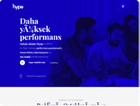
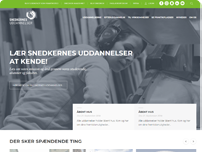
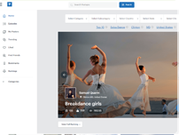
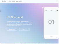
Some things we’ve done.
Frequently Asked Questions
We’ve put together a comprehensive F.A.Q. on the topic of HTML Web Design. We hope this will help you decide whether this is a valid solution for you. For any other questions not covered here, feel free to send us an email atinfo@xhtmlchop.comORcontact us.
-
1.What is a "HTML" website?
-
A
-
A
-
2.Why do I need a HTML website?
-
A
Web browsing is more than desktops now. Web browsing on tablets and mobile phones is rising in a major way, and more and more people are doing their online shopping and browsing from smaller devices. A HTML website allows you to reach 100% of your audience.
-
A
-
3.What are the other benefits to HTML web designs?
-
A
A HTML website allows you to keep one universal website rather than separating sites for mobile and web browsing. They are also easy to maintain, and generally keep your web presence simple to control.
-
A
-
4.Will my responsive HTML pass Google's Core Web Vitals?
-
A
Yes. We code with a performance-first mindset. Our HTML/CSS is lightweight and optimized to ensure your site loads fast and achieves high scores on Google PageSpeed Insights.
-
A
-
5.Is my responsive website going to be compatible with any browser?
-
A
Our responsive HTML is compatible with all modern evergreen browsers, including the latest versions of Chrome, Firefox, Safari, and Edge.
-
A
-
6.Do you convert Figma, Adobe XD, or Sketch to HTML?
-
A
Yes! While we are experts in PSD conversion, we primarily work with modern design tools. We ensure that all design specs, assets, and prototypes are precisely translated into clean, 100% Human-Written, Zero-AI Generated Code for Maximum Precision, and responsive HTML/CSS. You can find more details on our specialized pages for Figma to HTML, Adobe XD to HTML, and Sketch to HTML
-
A
-
7.Is there a way to check whether my website is responsive or not?
-
A
Yep! And it’s incredibly easy. Open your website on a desktop window and resize the window. If the layout changes, you have a responsive website. Resize this window right now to check out our responsive site and how it all works!
-
A
-
8.How long will it take to launch a responsive website?
-
A
On average, 3-4 days, but each project varies.
-
A
-
9.Can I convert my existing website into a responsive one?
-
A
Of course. We’re there not only to help you create a responsive theme from scratch, but to modify existing templates to become more mobile-friendly.
-
A
-
10.What will be the cost?
-
A
We charge $175 for a home page and $109 per inner page. The cost is a function of how extensive your project is, but we’re happy to discuss the pricing options with you as you consider your project with us.
-
A
-
11.Which devices do we talk about in relation to responsive websites?
-
A
When we speak of multi-screens, we’re talking about multiple devices, from tablets to smart phones.
-
A
-
12.What are CSS media queries?
-
A
A CSS media query will set a limit on the scope of the style sheet, including line height, font size, and the like. It’s simply a way to establish a web page style that is consistent. Find out more at :https://www.w3schools.com/css/css_rwd_mediaqueries.asp
-
A
-
13.Can I add images and videos to my HTML website?
-
A
Sure! Media queries make it easy to add flexible image sizes and flexible video displays.
-
A
-
14.What are some screen sizes that a responsive website will adapt to?
-
A
Some of the most popular include:
- 320px
- 480px
- 600px
- 768px
- 960px
- 1024px
- 2048px
-
A
-
15.What are examples of some great PSD to HTML CONVERSION websites?
-
A
Check out the following: https://xhtmlchop.com/examples/psd_to_responsive/05/ https://xhtmlchop.com/examples/psd_to_responsive/06/ https://xhtmlchop.com/examples/psd_to_responsive/07/ https://xhtmlchop.com/examples/psd_to_responsive/08/ https://xhtmlchop.com/examples/psd_to_responsive/09/ https://xhtmlchop.com/examples/psd_to_responsive/10/ https://xhtmlchop.com/examples/psd_to_responsive/11/ https://xhtmlchop.com/examples/psd_to_responsive/12/
-
A
-
16.Which new HTML CSS frameworks are available?
-
A
Bootstrap 5,tailwind css, Semantic UI, Materialize CSS, Bulma, and Foundation 6.
-
A
-
17.What’s the difference between a Default CSS Framework and the Bootstrap 5 Framework?
-
A
Default CSS means building your website completely from scratch, making it uniquely lightweight and super fast for Google. Bootstrap 5 uses high-quality pre-made parts, which makes building your website much quicker and easier to update later, though the files are a tiny bit heavier.
-
A
-
18.
 Why Bootstrap 5 ?
-
A
Bootstrap 5 is the industry standard for building fast, responsive websites. It uses high-quality pre-made parts that allow us to code your site much quicker. Because it runs on pure, modern JavaScript without heavy add-ons, your pages load fast, look perfect on all phones, and are easy to update.
-
A
-
19.What is the recommended width for using Bootstrap 5 Framework?
-
A
Bootstrap 5 doesn't restrict you to a single width because it is fully responsive, but it is built around a standard maximum layout width of 1320 pixels for extra-large desktop screens.
The framework automatically manages your content width using pre-defined steps called breakpoints. It adjusts seamlessly from small mobile screens up to large displays, ensuring your layout feels natural and looks sharp on any device.
-
A
-
20.Is Bootstrap 5 compatible for lower/older browsers?
-
A
Bootstrap 5 is designed for the modern web, so it works perfectly on all up-to-date browsers like Chrome, Safari, Edge, and Firefox. However, it drops support for older, legacy browsers. Most notably, it does not support Internet Explorer at all.
If your target audience uses old devices or outdated browser versions, some modern layouts and animations might not display correctly without extra custom styling.
-
A
-
21.What’s the difference between a default responsive framework and foundation framework?
-
A
A Default Responsive Framework usually refers to a lightweight, basic layout system (like a standard 12-column flexbox grid). It provides just the essential grid, margins, and padding needed to make a website shrink and grow on mobile devices. It does not come with pre-designed buttons, menus, or themes. This is perfect for developers who want a quick, clean starting point without any extra weight, allowing them to build a highly custom design from scratch.
The Foundation Framework (built by ZURB) is a massive, professional-grade toolkit designed for complex enterprise websites and web apps. Unlike basic grids, Foundation is highly customizable and packed with advanced features like built-in responsive menus, sliders, modals, and motion animations. It is known for its "semantic" approach, meaning it keeps the underlying code very clean and structured. It offers incredibly precise control over layouts on different screens, but it has a steeper learning curve and adds more file weight to your website.
-
A
-
22.
 Why Foundation Framework ?
-
A
Foundation Framework is chosen for complex, enterprise-level websites that require advanced customization and semantic code. Unlike other toolkits, it doesn't force a specific look onto your site, giving you total design freedom. It features a powerful grid system, built-in animations, and professional mobile components that ensure your layout is accessible, highly secure, and easy for large teams to scale.
-
A
-
23.What is the recommended width for using Foundation Framework?
-
A
The Foundation Framework is built to be fully responsive, but its default recommended maximum width for desktop screens is 1200 pixels (or 75rem in the code).
The layout automatically shrinks to fit smaller mobile screens perfectly. If your design requires an ultra-wide or full-width look, this maximum grid size can easily be customized to any width you need.
-
A
-
24.Which version of Foundation do you use?
-
A
We use latest Foundation Zurb framework.
-
A
-
25.Is Foundation compatible for all browsers?
-
A
Foundation is highly compatible with all modern web browsers, including the latest versions of Google Chrome, Apple Safari, Mozilla Firefox, and Microsoft Edge on both desktop and mobile devices.
However, because newer versions of Foundation rely heavily on modern CSS layout tools like Flexbox and Grid, it drops support for older, legacy browsers. Notably, it does not support Internet Explorer 11 or below, meaning users on obsolete browsers may experience layout layout shifts or missing features.
-
A
-
26.Can AI convert PSD to Responsive HTML?
-
A
While AI can assist in generating basic code, it often lacks the precision required for complex designs. At Xhtmlchop, we combine AI-assisted speed with manual human refinement to deliver pixel-perfect, error-free HTML.
-
A
-
27.How can I convert PSD file to HTML?
-
A
PSD files are a type of image file that contain the design of a website or a web page. To convert a PSD file to HTML, you need to use a tool that can slice the PSD file into different elements and generate the corresponding HTML code. There are many online and offline tools that can do this, such as Adobe Photoshop, Adobe Dreamweaver, PSD2HTML, etc. The steps may vary depending on the tool you use, but generally they involve:
- Opening the PSD file in the tool and selecting the elements you want to convert.
- Adjusting the settings for the output HTML, such as the file name, the folder location, the image format, etc.
- Clicking on the convert or export button and saving the HTML file.
Another option is to work with a xchop web developer who can code the HTML from the PSD file by hand. This may allow you to have more flexibility and customization over the design and functionality of your website or web page.
-
A
-
28.What is HTML web page creation?
-
A
HTML stands for HyperText Markup Language, and it is the standard language for creating web pages and web applications. HTML describes the structure and content of a web page using tags and attributes. HTML tags are keywords that define how the browser should display the content or perform an action. HTML attributes provide additional information about the elements or modify their behavior. HTML web build up is the process of designing, coding, testing, and maintaining web pages using HTML and other related technologies, such as CSS, JavaScript, and PHP. HTML web transformed can be done using various tools and editors, such as Notepad, Visual Studio Code, Dreamweaver, etc. HTML web Design requires a good understanding of the syntax and semantics of HTML, as well as the best practices and standards for web design and accessibility.
-
A
-
29.What is a web Design service?
-
A
A web Design and developemnt service is a type of service that creates, designs, and maintains websites for clients. A web user experience design service can offer various solutions, such as web design, web hosting, web programming, web security, web marketing, and more. A front-end development Service can help clients achieve their online goals, such as increasing their visibility, reaching their target audience, improving their user experience, and generating more revenue. A web page creation service can work with different technologies, such as HTML, CSS, JavaScript, PHP, Python, Ruby, WordPress, Shopify, and more. A web development service can also provide support and maintenance for the websites they create or manage.
-
A
-
30.Do Web developers still use HTML?
-
A
Web developers use HTML to define the elements of a web page, such as headings, paragraphs, images, links, forms, etc. HTML is not a programming language, but a markup language that works together with other technologies, such as CSS and JavaScript, to create dynamic and interactive web pages. HTML is still widely used by web developers today, as it is the foundation of the web and it is supported by all browsers. However, HTML has evolved over the years and new versions have introduced new features and capabilities. The latest version of HTML is HTML5, which was released in 2014 and is still being updated. HTML5 offers more semantic elements, multimedia support, offline storage, geolocation, drag and drop, canvas, web sockets, and more. Web developers who want to create modern and responsive web pages need to learn HTML5 and use it in combination with other web technologies.
-
A
-
31.Why do I see a limited number of examples in your portfolio?
-
A
Absolutely not! We have built over 80,000 websites since 2007. We are a company that ensures that the NDA signed with our clients is guarded fully. We do not post any projects in our portfolio without our clients’ permission. So we have posted limited projects in our website for which we have our clients’ approval. You can however send us a mail at info@xhtmlchop.comif you want to see more samples. You can also contact us through the live chat facility in our website.
-
A
-
32. Money Back Guarantee / Refund
-
A
Money-Back Policy We guarantee to give you a refund only in following circumstances:
Your order cannot be finished on time.
You are dissatisfied with the final product, and the project file is stored on our server. A refund is applicable.
Your request to cancel the order is received before the order is initialized.
A refund is not applicable under the following conditions.
Project zip is delivered or installed or downloaded.
The project is completed on the client's dedicated server.
*Please note no refund will be applicable after final zip is delivered or installed or downloaded. The files are only delivered or installed or downloaded once the customer is fully satisfied with the work.
-
A