10 Tips on Responsive WordPress Site Development
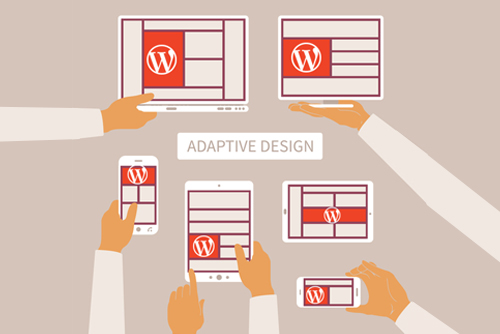
 Responsive WordPress themes have helped create a new approach to web design. Sites can easily be built to offer optimal viewing experience on a variety of devices, including desktop computers and smartphones, allowing owners to tap into recent advances in mobile communications and Internet traffic trends using WordPress Development Service. Designers can follow these techniques to achieve remarkably responsive results.
1. Setting Breakpoints
Setting breakpoints according to content embraces the principles of responsive design in terms of adaptability, fluidity, and flexibility. The practice of catering to each new resolution through specific breakpoints does not always provide the best solution. It’s highly beneficial to adjust designs when everything fits properly, thus eliminating the need to retrofit media queries for new devices.
2. Simulate Layout using Photoshop
Using image manipulation programs like Illustrator, CorelDraw, or Photoshop allows you preview the layout as it appears on a variety of device platforms. You can clean up any imperfections by exporting the layout to Edge Reflow CC. The CSS can then be transferred to a program like Dreamweaver that allows you to make the final touches.
3. Fluid Grid-Based Layouts
Fluid layouts play an important role in the design of good responsive layouts. The easiest way to make websites adapt to varying screen resolutions involves the use of a fluid layout with widths defined in percent rather than pixels.
4. Image Flexibility
The manner in which responsive WordPress layouts adapt to the size of their parent container is a crucial aspect that demands special attention. This can be achieved by setting a maximum width of 100%, thus the images will remain narrower than the parent container.
5. Navigation
Well-designed navigation systems ensure optimal user experience regardless of the device used to access a site. This area is particularly important for mobile devices because there is a need to prioritize core content, thus eliminating non-essential elements.
6. Mobile First Approach
Starting with mobile-centric features allow you to take a progressive approach that not only covers all bases, but also helps iron out typical mobile design constraints. Mobile platforms are served using an advanced layout, and the needs of desktop platforms are dealt with thereafter.
7. Content Strategy
Incorporating a well-formulated content strategy into the responsive design process makes content more accessible and readable. You can either employ graceful degradation or progressive enhancement as a means to ensure the content addresses the needs of users. Framework and structure should be influenced by research on user trends.
8. Sketch and Prototype
Sketching enables you to analyze and refine raw ideas before laying foundations on which to build prototypes. This approach helps generate evolutionary and iterative layouts in a timely fashion as opposed to undertaking long-winded mock-ups.
9. Compress Site Elements and Content
Making use of file compression programs optimizes page resources, which in turn improves transmission across networks. The content becomes easier to access for different devices on which bandwidth varies.
10. Cross-browser Compatibility
Enabling cross-browser compatibility is one of the most important tasks faced by designers concerned with responsive design development. It’s necessary to keep compatibility in mind throughout the design process to ensure an error-free and functional WordPress site. The three following solutions are most effective in helping media queries work within multiple browsers: respond. j’s, modernize and adaptive. 960. j’s.
In the end, responsiveness enable WordPress sites to load much faster regardless of device or browser. The approach offers additional benefits, including the ability to improve SEO, improve user experience, and eliminate the need to create multiple versions of a website, among others.
- Comments
- Leave a reply
