Top 7 Responsive Frameworks for your website
Gone are the days when we were dependent only on PCs to browse the internet. Today is an era of Smart phones & Tablets. Everyday, breakthrough technology is inventing new devices to make our lives easier.
That’s why every business, big or small, start up or even a freelancer is opting for Responsive Websites.
Responsive Websites are designed in such a way that it can be browsed from any device such as Desktop, Smart phone, Tablet or even TV. Plus, these are latest browser compatible, without losing site’s harmony. It gives you a power to connect to every customer on the globe.
Now that Responsive Frameworks is such an important concept, it is inevitable that there will be many corporations providing this amazing tool to help you build websites. It is possible to get confused to decide which responsive framework is best as each framework is unique in its own way & has peculiar purpose.
We have researched some of the best frameworks for you & have provided their Merits & Demerits for your consideration.
Let’s look at them one by one:
01. Twitter Bootstrap
Designed for everyone, everywhere.
That’s the statement from Bootstrap itself and justifies it perfectly.
Bootstrap is the most popular and most power-packed responsive framework you will experience today.
- It is an HTML, CSS and JavaScript front end framework with the Mobile First purpose
- Bootstrap consists of 12 column grid system with 13 custom JQuery plugins
- It is easy to set up & faster in operation
- Suitable to all project sizes
Key Features:
Bootstrap has limitless features & customization options to empower your website. Some of them are:
- Base width selection:
For Fluid – 480px, 768px, 992px, 1200px - Variety of Components:
Button dropdowns, Navbar, Breadcrumbs, Pagination Jumbotron and much more - Custom JQuery Plugins:
Scrollspy, Carousel, Popover dropdown - Visible-Hidden options specific to devices
- Bootlint:
It is the linter tool of Bootstrap which automatically checks the common HTML mistakes occur in webpages. It’s fairly useful. - Extensive Documentation for Support
Browser Compatibility:
Google Chrome for Mac, Windows, iOS, and Android, Safari for Mac and iOS, Firefox for Mac & Windows, Opera for Mac and Windows, IE8+
Issue with Bootstrap:
Let’s say sometimes Bootstrap is a victim of its own offerings. It has so many features that sometimes it becomes difficult to understand each one of them thoroughly. You have to invest some time to get a hold on to them. However, to overcome this complexity, Bootstrap has provided great documentation & community support to help you understand them easily.
Be it any project, small or big. Bootstrap’s easy set up & working and huge list of features make it a first choice in today’s responsive frameworks.
02. Foundation

One of the most advanced responsive frameworks available today, Foundation (Latest 5.5) is at par with Bootstrap.
- Front-end, lightweight HTML5 framework
- It is built with Sass, enabling you to build & customize websites very quickly
- Best in class default 12 column grid layout
- Simple & faster
Key Features:
- Different layouts based on the size of browser
- Interchange: this tool makes use of media queries to dynamically load responsive content which is appropriate for different users’ browsers and device
eg. A small static google map on mobile,A large static map for medium sized device &Full interactive Google map for larger display devices - Source Ordering:
Allows to display the most important content on top when the customer is browsing on Mobile - Command Line Interface (CLI):
CLI helps complete the projects faster than before - Libsass:
A new Sass processor which works lightening fast with Foundation 5. Claimed to be 32x as fast sometimes. - Orientation Detection:
Magellan type navigation is a sticky one which helps customers keep a track of where they are on the page without scrolling - Online training courses
Browser Compatibility:
For Desktop: Chrome, Safari, Firefox, IE9+
For Mobile: iOS, Android, Windows phone 7+
Issue with Foundation:
Like Bootstrap, Foundation’s features also accompany some complexity. You’ll have to understand them thoroughly to make every feature count for your site. They have provided Online Training Courses to educate yourself about their offerings though.
Such powerful tools from Foundation makes it an irresistible choice.
03. Gumby
Flexible. Fast. Powerful. That’s how Gumby is.
Gumby is becoming a favorite choice for responsive frameworks because of its utter flexibility and fully customizable features.
- Gumby is a responsive 960 Grid CSS framework powered by Sass, which helps creating websites very fast
- It has multiple grid types with different column variations which helps in creating flexible layouts
- Easy set up and quick operation
Key Features:
Gumby offers extensive list of amazing features. It gives you full freedom to customize the site in your own way.
- Multiple Grids:
Basic, Hybrid, Nested grids with Pushing, Pulling & Centered columns and much more - Mixins:
Allows you to re-use the chunks of CSS, giving you ultimate flexibility - Responsive Images
- Fully Customizable Buttons, Forms, Navigation, Tables
- Faster loading Toggles & Switches
- Shuffle & Parallax
Browser Compatibility:
Chrome, Firefox, Opera, IE8+
Issue with Gumby:
Problem with Gumby is you often face some bug problems. Websites created by Gumby also encounter responsive issues sometimes.
Overall, you will enjoy Gumby for its power packed features and customization freedom imparted by it.
04. Skeleton
In a world of infinite possibilities, simplicity is the best creativity you can achieve. Skeleton is that simplicity in a world of responsive framework. As the name describes, Skeleton provides you the basic structure to create responsive websites faster. It’s the best choice for beginners or small size projects.
- Skeleton is a small but beautiful collection of CSS files
- Helps in rapid development of responsive websites
- 12 column grid framework with maximum width of 960 px
Key Features:
Unlike Bootstrap & Foundation, Skeleton has limited features.
- Set maximum & minimum widths rather than setting device sizes & specifications
- Standard Media Queries
- Buttons, Lists, Forms
- Tables, Typography
Due to its basic & simple approach, Skeleton creates websites rapidly and can fit any size.
Browser Compatibility:
All latest versions of Chrome, Safari, Firefox and IE9+.
Issue with Skeleton:
As explained earlier, Skeleton is a basic framework. It has limited features. So, it is usable only for small projects & for beginners.
To summarize Skeleton, it is basic, beautiful & effective.
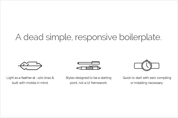
05. HTML5 Boilerplate
One of the first players in front end web development tools for HTML5 websites and apps, HTML5 Boilerplate is a highly recommended responsive framework. It is speedy, well structured and adaptable.
- Major global corporations such as Google, Microsoft, NASA use HTML5 Boilerplate
- Progressive enhancement is a primary intention
- It is just a simple platform, you can customize it fully according to your own need
Key Features:
As it is a simple framework, HTML5 offers basic but useful features.
- Mobile Browser Optimization
- Google Analytics Snippet
- Placeholder touch device icon
- Mobile friendly HTML Templates
- HTML5 Shiv: for non-modern web browsers
- jQuery & Modernizr Library
Browser Compatibility:
Latest versions of Chrome, Safari, Firefox, Opera & IE8+.
Issue with HTML5 Boilerplate:
HTML5 Boilerplate is a starting point in the responsive framework journey. With its standard but basic offerings, it’s not suitable for every project.
Nonetheless, HTML5 Boilerplate is a great tool to start with responsive framework and create websites instantly. It is highly advised to try it out. You won’t regret it.
06. Pure
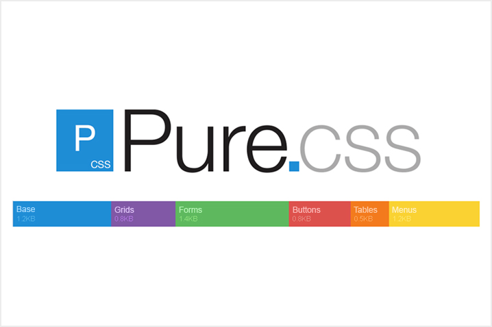
Smallest things often create big wonders. Yes, we are talking about Pure.
Pure is a CSS framework with a minimal footprint. With surprisingly small size of its files, it offers so much customization.
- Built on Normalize.css
- Mobile first concept
- Entire module size: 4.4 KB minified and gzipped
Key Features:
- Layouts: Set different layouts such as Blog, Email, Landing Page, Photo Gallery,etc.
- Hiding Elements
- Highly customized grids
- Trendy Buttons: Disabled, Primary, Active Buttons
- Skin Builder
- Menu: Horizontal, Vertical, Dropdown
Browser Compatibility:
Chrome, Safari, Firefox, IE7+, iOS 6.x, iOS 7.x, Android 4.x
Issue with Pure:
Although Pure is simple and fast, it has many features as that of Bootstrap. So, be prepared to spend some time to learn them. It can get complicated.
The absolute advantage of Pure is that it can be used for any project, small or big. It has amazing flexibility and its fast. So, Pure!
07. Ivory
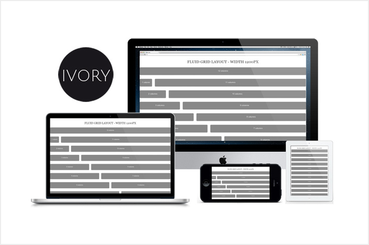
Amongst so many responsive frameworks, some of us tend to forget this simple and classic framework. Ivory is fast & easy and it should be definitely considered when you are deciding to make responsive sites.
- Responsive front-end framework
- 12 column fluid grid
- Takes you from 1200px to 320px
- Flexible and enables us to create sites compatible with Mobiles to TV
- Lightweight
Key Features:
- Define your own width. Plus, 4 width layouts: 1200px, 1140px, 1024px & 960px
- Typography: Customize List, Table, Blockquote
- Components: Forms, different Buttons, Pagination, Breadcrumb, Accordion and much more
Browser Compatibility:
Like all other frameworks, Ivory also provides support to all latest browsers – Chrome, Safari, Firefox, IE8+.
Issue with Ivory:
As such, there are no problems frequently associated with Ivory. it’s simple & fun.
Ivory may not be as feature packed as that of Bootstrap or Foundation, but it is very fast and you will have an ever satisfying experience with it.
Conclusion:
Each website has its own intention to serve the customers. So, while deciding these frameworks, think which framework will work best for you.
Big projects will use Bootstrap for its abundant features and support while smaller one might opt for HTML5 Boilerplate or some others. There are no fixed rules for these situations.
Also, no framework is perfect. Each one has its own advantages & limitations. So, you have to decide which framework gives you more advantages than limitations.
Have a brainstorming session with your team and be clear about your website’s intention. It will definitely help you in the decision making of Responsive Frameworks.
Of course even you can share your own list of top frameworks. Let’s help the community with your thoughts.
- Comments
- Leave a reply
Recent Posts
Follow us and get latest updates!
-
Email Updates