Responsive Email Design – What You Need To Know
Responsive Email Design – What You Need To Know
One segment of online marketers propagate that email marketing dead while there is another segment that uses it very effectively getting better results than ever before. In fact email marketing should work better than before because today people carry their internet enabled devices in their pockets unlike before whereby internet enabled devices just sat in their offices. What those who are using email marketing successfully have learnt to do is to create responsive email designs that increased the reach of their campaigns three times more. Here are few key factors you might want to know about responsive email designs.
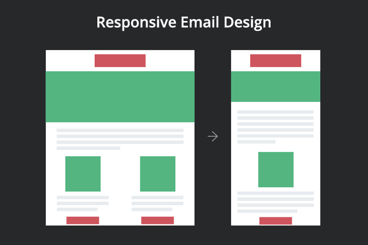
- When you make use of responsive email design the content automatically resizes itself based on the device used. Today we have hundreds of handheld devices and each one with a different display sizes and specifications. Responsive designs enable optimal user experience regardless of the devices used. If you do not use responsive design, this advantage will be totally missing and the users need to constantly zoom in and zoom out and be frustrated with extensive horizontal scrolling.
- The responsive design technology first identifies the device type and calls the most respective stylesheet to display the content in suitable format. Everything happens in a seconds and the user is not even aware because he or she just sees the best matching layout for their device right from the word go. A wide range of devices and application platforms are supported, all the most popular devices and applications are normally taken care.
- Regardless of the nature of your business, whether you are a B2B or B2C the growing trend is that most people access their emails on the go, as they are travelling, waiting in the airport lounges, commuting to work, responsive emails will capture all these people effectively. Statistics indicate that the percentage of people that use mobile devices is increasing day by day. If you are not accessible through the handheld devices, then you will not accessible at all soon. So get ready for the game. The challenge however is creating designs that will not lose its design appeal while at the same time retaining its user-friendliness. You are going to need real experts who can take care of this for you.
- A key factor to be remembered when responsive designs are created is not to forget the importance of keeping things interesting for the desktop users and those who use devices with large displays as well. You need to carefully plan your ‘call to actions’ and position them strategically so that the click through rate is high. Further to that, even in the laptops the displays are becoming touch sensitive. People are more and more used to ‘touch selection’ so make all the buttons which are actionable, touch enabled so that you enjoy higher rate of conversion with your emails campaigns.
- The way forward is undoubtedly, responsive email designs. If you have not already switched to responsive designs, it is high time that you get moving in this direction if you do not want to be left out in the competition.
Defaut Email Clients Compatibility
| Client | Media Query Support |
| Amazon Kindle Fire | Yes |
| Amazon Kindle Fire HD | Yes |
| Android 2.1 Eclair | No |
| Android 2.2+ | Yes |
| Apple iPhone | Yes |
| Apple iPad | Yes |
| Apple iPod Touch | Yes |
| BlackBerry OS 5 | No |
| BlackBerry OS 6+ | Yes |
| BlackBerry Playbook | Yes |
| Microsoft Windows Mobile 6.1 | No |
| Microsoft Windows Phone 7 | No |
| Microsoft Windows Phone 7.5 | Yes |
| Microsoft Windows Phone 8 | No |
| Microsoft Surface | No |
| Palm Web OS 4.5 | Yes |
| Samsung Galaxy S3+ | No |
3rd-party email clients
| Client | Media Query Support |
| Microsoft Outlook Exchange 3rd party app (Android) | No |
| Gmail mobile app (all platforms) | No |
| Yahoo! Mail mobile app (all platforms) | No |
*Gmail app for Android: Partially Works. Since it does not recognize media queries, it will render large breakpoint (non-responsive).
- Comments
- Leave a reply
Recent Posts
Follow us and get latest updates!
-
Email Updates