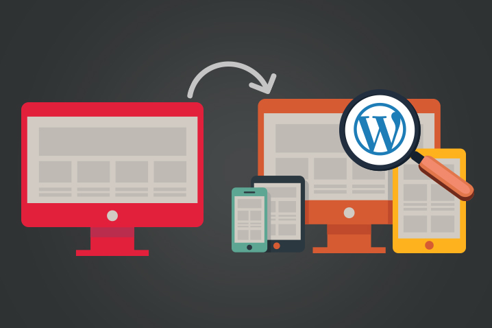
Non-responsive to Responsive WordPress Website – Why?
Non-responsive to Responsive WordPress Website – Why?
Do you already have a WordPress website for your business, which you built years ago? The chances are that you do not have a responsive website. Today, all the new WordPress websites are built using responsive web design technology. Some of you may not be aware what responsive websites and while others might be cogitating whether to switch from your non-responsive WordPress website to a responsive website. Should you now rock the boat or should you just continue with the existing website? These are some of the questions that you cannot possibly evade as a webmaster or as a business owner. In this post, let us look at some of the most important validating reason why existing WordPress websites should go for a complete overhaul of their existing website and make it into responsive website.
What exactly is responsive web design technology?
When a website is designed using responsive technology, the pages of the website will automatically resolve itself to suit the gadget used to access the website. Previously, many businesses hosted two websites, one for visitors that came to the website through devices such as desktop computers and laptop computers and another for hand held devices such as PDAs and mobile browsers. Users need to choose the website after landing the desired page whether to use mobile version or the desktop version. Today that is not the case, users are served automatically the right type of pages based on the nature of the gadget used. Some websites however still provide the option to the visitors to choose the full desktop version after they have landed the device specific pages.
What happens to the users when you do not have a responsive website?
Let us presume that you are continuing to have your good old conventional website in WordPress. Today visitors can access your website through any of the following websites:
Desktop computers
Laptop computers
Tablet PCs
iPads
Smartphones
iPhones
Blackberries
Smart watches and so on…
We can’t predict what more new devices would come into the market that are also internet enabled. Today customers access the brand websites even when they are on the move. Previously people stayed away from the internet only when they travelled today, even traveling does not separate them from the internet. Websites are generally designed keeping the display size of the desktop or laptop computers. However, all the other devices that we have listed above have smaller displays. If the pages that are meant for desktop computers have to be squeezed into a small 4-inch display then the users will find it difficult to read the content of the pages. They become so tiny when they are displayed in the small displays of handheld devices. Tablet PCs have their own plight, the proportion of the display varies here disorienting the elements of the page resulting in a sloppy web page that could not possibly impress the visitors.
Users need to constantly zoom in and zoom out of the page. Moreover, they cannot make any selections as all the buttons will be so tiny and making a selection without touching the next button will certainly demand special skills from the users. All these will in no time irritate the users. You could easily guess what will happen when the visitors are frustrated. They will leave your website in no time. In other words, you are going to lose those leads very badly. It will be a very bad mistake not to leverage the visitors that have already landed your website. You will not only be losing those visitors for this time but they will never return to your website because of the bad browsing experience your website offers them.
Draining of marketing and SEO budget
If you have been in the game for long enough, you will know how challenging and how difficult it is to get top ranking in leading search engines like Google. You will also know how much it costs the website owner to get every single visitor to the website. If you are going to lose those precious visitors after they have landed your website then it is simply equivalent to throwing your marketing funds away carelessly. On the other hand, if only your website has been built using responsive technology and offers the users the best browsing experience then, you have very good chances of converting a sizeable percentage of those visitors into prospective customers even if you do not get 100% conversions.
Tapping the visitors from social media sites
If you are engaged in social media marketing then for your efforts to yield the expected results, you must have a responsive website. Most of the social media activity takes place through mobile devices. You could therefore expect over 70% of your social media traffic to access your website or the targeted pages through mobile devices. You should give them optimum experience to those visitors. If you fail in this regard, then you would be squandering away your social media visitors too. There is no rocket science behind this, you just need a moment to understand your profit and loss here.
Search engines give special weightage to responsive websites
Google keeps no secret about the fact that it gives special weightage to mobile friendly websites. Google is always focused on offering its customers with exceptional user experience. It will keep away all those factors that hamper this experience. Visiting a non-responsive website through a mobile device is certainly a torturous experience and Google is certainly not going to like that. Google has made an open statement in this regard and states clearly that mobile friendliness is one of the ranking parameters.
Bounce rate too counts
Yet another factor that you need to pay attention to here is the bounce rate. How much time each visitor is spending in your website is an indication whether they like what they see or not. For the search engines it is an indication whether the site listed is the right match for the search that has been made by the visitor. If the visitor finds what they are looking for then it is the right match. Visitors are likely to spend more time in such websites. On the other hand, if the visitors are going to leave the page even before it is fully loaded or too quickly then the search engines take these as cues for irrelevant listing or bad match. If this pattern continues for a considerable period then the search engines will drop your website from the listings even if your website is the right match. Your website will be dropped from the listings for the wrong reasons, which anyway will hurt your business very badly. To keep the visitors for long enough you need to serve the right pages based on the gadget that they are using to access your pages.
Don’t miss the mobile shoppers
Many buyers today make use of their mobile devices to shop in your website. If these visitors do not have a seamless shopping experience, they will be scared to use your website for shopping. They will not be comfortable using their credit card or debit card because of the fear that the transaction will be hauled mid-way and that their cards charged still.
Mobile phones stay with the users for longer part of the day
When compared to the laptops and desktops people literally live with their mobile devices. It makes more sense to get your act right as far as mobile friendly websites are concerned. We have statistics that indicate that more than 60% of the people in the US take their mobile phones even to the restrooms. You would certainly not want to lose this crowd by providing them with a horrid browsing experience.
What next?
We can list many more such reasons that will validate your decision why you should immediately switch your website from non-responsive WordPress design to responsive WordPress design. Knowing these facts alone is not going to do you any good. So what next? What should you be doing next?
Find a good PSD to WordPress conversion company that can build responsive websites from the PSD that you provide. Building a responsive website is a complex task and it is important that you have the right skills to handle the job. We are not talking about just PSD slicing but creating a fully functional website that will resolve correctly in all the devices regardless of the display size.
There are of course readymade responsive website themes for WordPress available online. Even though the temptation is just to settle for the easiest route, one should not succumb to that temptation. Create your own custom design for your WordPress website. You do not want to use a design that does not speak out what your brand stands for. It is possible to communicate your message effectively only when you create a custom website design.
The PSD markup industry offers you with many options. It is not that there is shortage of options. You will be able to find your WordPress service provider that is capable of meeting your needs and do complete justice to it.
A bit of learning is certainly required
It certainly does not hurt to educate yourself a bit about the basics of WordPress websites. It is time to stop that ‘I don’t know much about all these things.’ refrain if you want to make your website stand out. There is no way you could make well-informed decisions if you vow to remain ignorant. Therefore, it is high time that you started putting in some efforts to educate yourself and the sooner the better.
Keep to the latest trends
When we are talking of keeping oneself updated of the latest WordPress technology, responsive designs and other related factors, we need to remember here that it is not a onetime effort. You will need to work on it continually. By the time you think that you are ready and that you have fairly decent knowledge about your WordPress website and the related matter, already a new technology will replace the old. For example, if we have been thinking that smartphones have small displays and the websites should be responsive enough to work well with the smartphone displays, then what have to say about smart watches and the displays nothing more than a few centimeters! You need to keep yourself equipped and do not shut yourself out from the latest technology.
Think 360-degree
If website owners are hesitating to move from their conventional WordPress websites to responsive designs what could be the reason? Yes, the cost involved in the conversion process. This is where 360-degree thinking is essential. As a webmaster you should not always think just about saving money. You need to reach to the largest audience possible. If you think along these lines, if by switching to responsive website should help you drive more traffic and increase your client-base then that is what you should be doing without any hesitation. If you think that you are saving money by not hiring a PSD conversions company, then you should be prepared to face the loss through the number of visitors that will flee your website even before it loads.
Given today’s competition levels, the only way you could tackle the situation is by taking a holistic approach. You cannot afford to leave any stone unturned.
Mobile friendly designs load faster
If you have tried browsing a responsive website in a mobile browser as well as in a desktop browser, you will notice that the mobile friendly pages load faster in your mobile phone. It is not just the size of the fonts and image that make the browsing experience better but also the speed at which the pages load in the respective devices that makes the overall browsing experience enjoyable. Moreover, it is a key ingredient to be successful with your mobile users. Remember, mobile users are very impatient users. They are browsing your website on the go, when they are in the elevator, traveling, while trying standing in the queue. What else do you expect? We repeat ourselves here again, you better be equipped to face such impatient audience.
Get your WordPress service provider optimize the pages for better page speed score
Do not think that page speed increases automatically when you make the pages responsive. You could further optimize your pages to boost your page speed score. There are several technical tweaks that you could make to load the pages faster. For example reducing the number of server requests a page makes the page will load faster. It is not necessary that you should know all the technical details. Talk to your WordPress conversions company and they will take care of the rest, provided you have selected the best company in the industry.
Before signing up with your service provider, you need to check their capabilities and also understand what exactly they will deliver. This is where educating yourself gets crucial. You need to know what to ask and what to demand, if not number of service providers will deliver the bare minimum and still claim to have offered you the best services possible, you too tend to believe them.
To summarize
We cannot emphasize here the importance of switching from regular WordPress to responsive WordPress website. There is all-round benefit from giving your website users with optimum browsing experience to winning the trust of the customers to securing good ranking in the search results. Moreover, you need to project yourself as a brand that keeps itself abreast with the latest trends.
Further to that you should not have a very limited outlook about marketing. You need to understand marketing is not just about making cold calls, sending out emailers or throwing a few popup banners online. Do not think that investing money in a good responsive website is wasting money. By giving your visitors good browsing experience, you will make them stay longer in your website, which will give them more time to learn about your brand, services or products. This in turn means they have lesser time with your competitors.
Thirdly, the role of your PSD to WordPress conversions company plays a very pivotal role. You need to select your service providers with utmost care. There is no room for mistakes here unless you want to waste both time and money while at the same time she risking your brand reputation.
Finally, always be on your toes to be the first one to update yourself with the latest technology and it will certainly give you an edge over your competitors. To do that, you just need to establish long-term association with a dependable web partner so that you are not frequently chasing after the best service providers. Moreover, when you choose to work with the same service provider they will be in a better position to gear you up for success. Make wise choices and do not wait for too long, act right away.
- Comments
- Leave a reply
Recent Posts
Follow us and get latest updates!
-
Email Updates