10 Tips on Responsive WordPress Site Development
10 Tips on Responsive WordPress Site
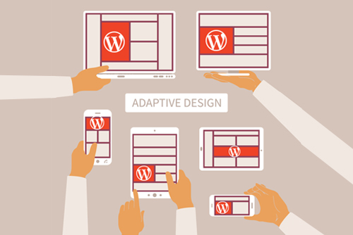
Responsive WordPress themes have helped create a new approach to web design. Sites can easily be built to offer optimal viewing experience on a variety of devices, including desktop computers and smartphones, allowing owners to tap into recent advances in mobile communications and Internet traffic trends using WordPress Development Service. Designers can follow these techniques to achieve remarkably responsive results.
Responsive WordPress Development in 2026: The Definitive Guide
In 2026, responsive web design has moved beyond simply making a site “look okay” on a phone. With the explosion of foldable devices, high-refresh-rate mobile screens, and Google’s strict Interaction to Next Paint (INP) metrics, responsiveness is now a core technical requirement for SEO and conversion.
This article breaks down the essential strategies for developing high-performance, responsive WordPress sites today.
1. The Mobile-First Logic (Modernized)
Mobile-first is no longer just a design choice; it is a coding requirement. In 2026, mobile devices account for approximately 65-70% of global web traffic.
-
The Strategy: Write your base CSS for a single-column layout without media queries. Then, use
min-widthmedia queries to introduce columns and complex layouts for tablets and desktops. -
The Benefit: Older or lower-powered mobile devices don’t have to parse “desktop-first” code only to have it overwritten immediately by mobile styles. This keeps the Total Blocking Time (TBT) low.
2. Advanced Fluid Typography with clamp()
Static breakpoints (e.g., “change font size at 768px”) feel jerky on modern fluid displays. Developers now use the CSS clamp() function to create truly fluid text.
Example Code:
font-size: clamp(1.2rem, 5vw + 1rem, 3rem);This instruction tells the browser: “Keep the text at least 1.2rem, let it grow based on 5% of the viewport width, but never let it exceed 3rem.”
3. Container Queries: The Component Revolution
For years, we relied on Media Queries (based on the screen size). In 2026, Container Queries are the standard for WordPress block development.
-
How they work: A block (like a “Related Posts” card) can change its layout based on the size of the column it sits in, rather than the whole screen.
-
WordPress Context: This is vital for “Full Site Editing” (FSE). It allows a designer to drop a block into a sidebar or a full-width footer, and the block will automatically adjust its layout to fit.
4. Performance Metrics: The “Interaction to Next Paint” (INP)
Google now prioritizes INP as a key Core Web Vital. This measures how quickly a page responds when a user taps a button or menu on mobile.
-
Responsive Fix: Avoid heavy JavaScript-based menus. Use CSS-only “hamburger” menus where possible.
-
Target: Keep your INP under 200ms. If a mobile user taps your menu and there’s a delay, your ranking will suffer.
5. Image Strategy for 2026
Images are the #1 cause of slow responsive sites. In 2026, the workflow has shifted toward automation and modern formats.
| Feature | 2026 Best Practice |
| Primary Format | AVIF (Standard) or WebP (Fallback) |
| Loading | Native loading="lazy" for all below-the-fold images |
| Sizing | Explicit width and height attributes to prevent CLS (Layout Shift) |
| Resolution | Using srcset to serve 2x resolution only to Retina/OLED displays |
6. Block-Based Themes vs. Page Builders
The era of bulky page builders (that load 1MB of CSS just to show a button) is ending.
-
The Trend: Developers are moving toward Block Themes (Full Site Editing). These themes use the native WordPress Gutenberg editor, which produces significantly cleaner HTML.
-
Why it matters for Mobile: Less “code bloat” means faster DOM (Document Object Model) parsing, which leads to a snappier feel on mobile browsers.
7. Touch-Target Optimization
With the average human fingertip being about 8-10mm wide, 2026 accessibility standards are strict:
-
Minimum Target: All clickable elements must be at least 44×44 pixels.
-
Spacing: Use at least 8px of “dead space” between links to prevent accidental clicks (especially in footers and navigation).
8. Variable Fonts: One File to Rule Them All
Instead of loading multiple font files (Bold, Light, Italic), 2026 developers use Variable Fonts.
-
Responsive Benefit: You can adjust the “Optical Size” or “Weight” of a font dynamically as the screen shrinks, ensuring maximum readability without the performance hit of extra font downloads.
9. Skeleton Screens & Perceived Speed
On mobile data (4G/5G), even a fast site has latency.
-
The Technique: Use Skeleton Screens—neutral-colored boxes that outline where content will appear—while the data is fetching. This reduces “perceived load time” and keeps users from bouncing.
10. Native Browser Features
Modern browsers handle responsiveness better than custom JS libraries.
-
Aspect Ratio: Use the CSS property
aspect-ratio: 16 / 9;on video containers to prevent “jumping” as they load. -
Scroll Snapping: Use CSS
scroll-snap-typefor mobile carousels instead of heavy JavaScript sliders. It’s smoother and uses zero CPU cycles.
Summary Checklist for Developers
-
[ ] Does the site pass Lighthouse mobile scores (90+)?
-
[ ] Are all images converted to AVIF or WebP?
-
[ ] Is the INP (interactivity) under 200ms?
-
[ ] Are Container Queries used for reusable blocks?
Here is a summary of the responsive WordPress development guide, along with details on how XHTMLChop can streamline this process through their specialized conversion services.
Article Summary: Responsive WordPress in 2026
Developing a high-performance site in 2026 requires a shift from “mobile-friendly” to mobile-optimal. The key takeaways include:
-
Logic: Adopt a Mobile-First coding strategy to reduce CSS bloat and improve load times on lower-powered devices.
-
Technique: Utilize CSS Grid, Flexbox, and
clamp()for fluid typography, alongside Container Queries to create components that respond to their parent element rather than the whole screen. -
Performance: Prioritize Core Web Vitals (specifically Interaction to Next Paint) by using lightweight Block-Based Themes and minimizing render-blocking resources.
-
Assets: Use AVIF/WebP images with native lazy loading and Variable Fonts to reduce HTTP requests while maintaining high design standards.
-
Experience: Focus on Touch Target sizing (min 44x44px) and use Skeleton Screens to improve perceived speed during content loading.
Xhtmlchop WordPress Conversion Service
If you have a custom design (Figma, Sketch, Adobe XD, or PSD) but lack the time or technical overhead to hand-code it into a responsive theme, Xhtmlchop is a leading industry veteran (operating since 2007) that bridges this gap.
Key Service Features for 2026:
-
Format Agnostic: They accept virtually any design source, including Figma, Adobe XD, Sketch, and PSD, converting them into pixel-perfect WordPress themes.
-
Clean, Semantic Coding: Every project is hand-coded using HTML5 and CSS3 (SASS/LESS) to ensure your site is lightweight, SEO-friendly, and free of the “div-soup” common in automated builders.
-
Performance Focused: XHTMLCHOP targets a 90+ PageSpeed Insights score by default, optimizing code structure for fast mobile rendering.
-
Advanced Theme Options: Conversions include a custom Theme Control Panel, allowing you to manage logos, headers, footers, and widgets without touching the code.
-
White-Label Ready: Highly popular with agencies, they offer a Non-Disclosure Agreement (NDA) and a dedicated project manager to act as an extension of your own team.
-
Post-Delivery Support: They provide 365 days of free support and a 100% money-back guarantee, ensuring your theme remains compatible as WordPress updates.
Xchop WordPress Service list below:
- WordPress With ACF
- WordPress Elementor Page builder theme
- WordPress Divi Page builder theme
- WordPress Woocommerce
- Html to Wodrepsss
Why Use a Conversion Service?
While page builders are convenient, they often struggle with the 2026 requirements for Interaction to Next Paint (INP). Xhtmlchop’s manual conversion ensures that only the necessary code is loaded, resulting in a site that is significantly faster, more secure, and easier to scale than a standard template.
Recent Posts
Follow us and get latest updates!
-
Email Updates