What is Responsive Web Development in 2026?
What is Responsive Web Development in 2026?
Most people use their phones to get on the internet. So Responsive Web Development is not something extra it is what people expect when they use the internet. In 2026 Responsive Web Development is not about making a website look good on a phone.
Responsive Web Development is, about making websites that can figure out what people need and change in time. Responsive Web Development is really important because it helps people use websites easily on their phones or computers.
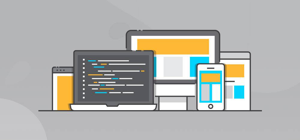
Responsive Web Development is what makes websites work well on all kinds of devices.
Beyond the Basics: How Modern Sites Adapt
Back then, web designers stuck to set breakpoints—one for mobile, one for tablet, and one for desktop. Things are a lot more complicated now. People use all kinds of screens: foldable phones, massive ultra-wide monitors, even smartwatches. To keep up, developers build sites with a “mobile–first” mindset and focus on making flexible components. That way, everything feels smooth, no matter what kind of screen you’re on.
1. The Shift to Container Queries
We’re moving past just using CSS Media Queries. By 2026, Container Queries are the main focus. Now, instead of tweaking things based on what the whole screen looks like, developers can make each piece—like a product card or a sign-up form—respond to the space it actually sits in.It doesn’t matter if someone’s browsing on a phone, a tablet, or a huge monitor. Every component adjusts itself to fit perfectly. The result? Sites become way more modular, faster to put together, and a lot more reliable.
2. AI-Driven Adaptive Layouts
Web designers are really leaning into AI now, and it’s changing how websites look and feel. The AI keeps an eye on what people do—tracking clicks, checking how long someone hangs around on a page. With all that info, it moves things around to make the site work better for the user. If you’re interested in something, the AI spots it and puts it right where you’ll notice. Buttons end up exactly where they grab your attention. Suddenly, it’s a breeze to find what you came for. In the end, every visitor gets a website that feels like it’s built just for them. That’s the magic of AI in web design.
3. Fluid Typography and “Clamp” Scaling
Now, we use fluid typography. It’s the smarter way. Text just adjusts itself. This is where the clamp function shines. Instead of picking a bunch of different sizes, clamp lets your text grow and shrink between a minimum and a maximum. So, when you drag your browser window wider or narrower, the text just scales with it. No more fussing—everything stays readable, always.
Why Responsive Web Development Matters
- Stay ready for anything: You never know what your customers are using—maybe it’s an old laptop, maybe it’s the newest foldable phone on the market. A responsive website keeps your brand looking sharp and working smoothly, everywhere.
- Boost your SEO: Google rewards sites that work well on mobile and load fast. If you’re using image formats like WebP or AVIF and hitting those “Core Web Vitals,” you move up the rankings. That turns into more eyeballs on your business—no magic tricks required.
- Put accessibility first: By 2026, every serious website follows WCAG 3.0 standards. That means buttons people can actually tap, proper color contrast, and support for features like Dark Mode or Reduced Motion. Everyone gets a better experience, not just a select few.
- Save money and time: Why juggle three separate apps when you can just keep one codebase? Responsive design cuts your maintenance costs and headaches, all while reaching your entire audience wherever they are.
Conclusion: Don’t Get Left Behind
Don’t let your business fall behind. Responsive web development isn’t just a trend—it’s what makes your website look sharp, run smoothly, and stay cost–effective over time. If your site still feels awkward or slow on a phone, you’re handing customers to competitors who already get it.
Upgrade your online presence now. Your users will notice the difference, and your bottom line will show it.
Need help putting together a checklist to give your web designer? I can help with that.
Recent Posts
Follow us and get latest updates!
-
Email Updates